
Design and User Experience: How Are They Related?
The author of this article is EPAM Product Manager, Sindhu Nair.

Other articles by this author:
Setting the scene
Monday morning
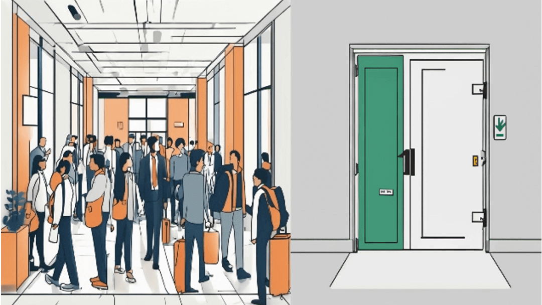
You enter your office lobby. It is super crowded because it is peak hour; the dreaded 08:55 AM. Your office is on the 3rd floor, and you can take the stairs. You head to the emergency exit to do so, and you see that the door has just a minimalistic small handle with a curve inward. You try to push the door, but it doesn’t work. When you pull it, it does. How is anyone supposed to know which way the door opens by just looking at the handle?
Saturday evening
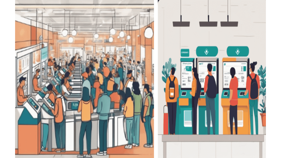
You are shopping in your usual grocery store. The check-out areas are flooding with people waiting to pay for their groceries. You just have 3 items. You think, “Should I just drop them? It will take forever to pay for this.” As you are about to abandon your items, you see a sign — a self-checkout. You go there. And you see a sign with minimal words and relevant icons to get you through the checkout — and voila — you have conquered the world and finished checking out in under 5 mins.
These two examples represent the gist of what User Experience (UX) is and why it can impact the potential of a product — steering it to great heights or a downfall!
What is UX design?
User Experience (UX) design is the practice of designing products, systems, and services with a focus on optimizing the user's overall experience and interaction. It involves understanding users' needs, behaviors, motivations, and contexts of use, and then designing solutions that are intuitive, efficient, and delightful to interact with.
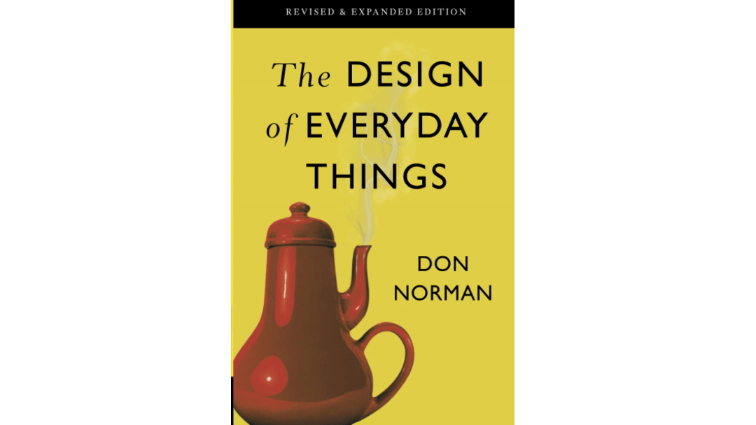
The first time I worked on a website design project for one of our clients, I was amazed at the amount of research and thought that goes into designing a user-centric product, with empathy being the guiding star. Like all of you, I wanted to know more and become sort of a UX expert overnight, so I googled, and the first thing I landed on was a link for the book “The Design of Everyday Things,” by Don Norman.
The Design of Everyday Things, and the key UX concepts
Before we get into it, let me provide some context about Don Norman and why this book is considered foundational in the UX field.
- Don Norman is a pioneering researcher, author, and academic widely regarded as one of the founders of the modern field of user experience (UX) design. His seminal book "The Design of Everyday Things" introduced revolutionary concepts like affordances, signifiers, and human-centered design principles, which laid the foundation for user-centric product development and became a bible for UX professionals worldwide.
This book changed the way that I thought about designing anything. This is what I want to share with you: an invitation to jump into the world of UX, latching on to the key UX design concepts and principles that I find helpful, as explained by Don Norman in his book.
Whether you're new to UX or just need a quick refresher, I hope to make your exploration a straightforward and engaging experience based on what I learned from this book.
Below, I explore some of the key UX concepts drawn from Norman’s work, including:
- Affordances and signifiers,
- Mapping and feedback,
- Conceptual models, and
- Human-centered design.
The information below is based on Norman’s work, but the descriptions and explanations are my own.
The first example above, with the emergency exit door, is something I started to notice after reading about it in the book. User Experience is supposed to make things usable and simple but, at some point, minimalist looks and aesthetics took over — and usability took a back seat. The same is true for simple things like TV remotes with so many buttons or car dashboards with so many functions that, if they came without a manual, would be very hard to figure out.
This brings me to our first concept for discussion — affordances and signifiers.
Affordances and signifiers
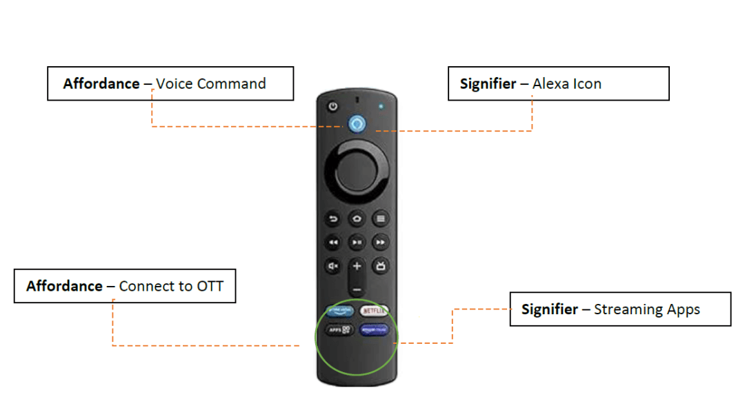
Affordances refers to the possible actions that an object allows or suggests to a user: a button is designed for pressing, while a door handle is designed for either pulling or pushing. Understanding the affordances of an interface element is crucial for designing intuitive interactions.
Signifiers serve as indicators or prompts that convey how an object or interface can be used. These cues may be visual elements such as symbols or text, auditory signals like tones or spoken instructions, or tactile feedback like textures or vibrations. Signifiers are the things that indicate how a product is to be used.
The everyday things that we see, interact with, eat/drink, etc., all have a purpose for which they were created, and an indication of how to use them. These are called signifiers and affordances. If I had to explain each in one line, it would go like this:
- affordances are what an object can do, and
- signifiers are how to make an object do what it is supposed to.
On the Amazon firestick remote, for instance, there are many buttons. Without having to refer to a user manual, a user can figure out what the buttons mean.
Recently there was a viral reel on Instagram in which a lady was trying to press the push button on the towel dispenser in a public bathroom, but nothing happened, and she was confused about whether she had to pull out the towel or press some button (there were none) to make it go or release a towel.
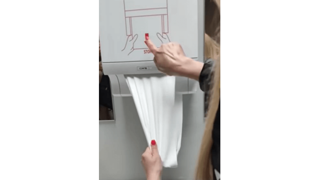
In this case, the towel dispenser can be considered an affordance, but there’s no signifier.
We know that it dispenses a towel (an assumption) but it does not say or show anywhere what you should do after usage, or that it rolls up, or that it’s a recyclable towel dispenser.
So, did the machine have a good design? Probably. Did it consider how humans perceive things differently? No. Was the lady not smart enough to understand it? No, the fault was not hers.
We know the what (affordance) and the how (signifier) of the product, but what about the way to accomplish the “what” and “how,” and the response from the product indicating that it’s been done?
This is where the next concept, mapping and feedback, comes into play.
Mapping and feedback
Mapping refers to the relationship between a user's actions and the corresponding effects or responses in a system. Effective mapping ensures a natural and intuitive connection between controls and their intended outcomes. A well-mapped design minimizes the cognitive effort required for users to operate a product or interface.
Feedback, on the other hand, involves giving users information about the results of their actions. It informs users about the current state of the system, and the consequences of their interactions. Feedback can take various forms, such as visual indicators, audio cues, or haptic responses. Appropriate feedback enhances the user experience by creating a sense of control and understanding.
The way to perform the action that a product can do, and the response from the product that you have done it, is what we call mapping and feedback. Let’s consider some real-life examples.
When we were building a new house, our architect suggested using a very minimalist, aesthetically pleasing doorknob for one of the bathrooms. My dad liked it so much that he jumped right on it and got one installed in his room. But, from the time it was installed, every time he tries opening the door, it takes him two tries to open it — first turning right, then left. Why? Because the minimalist knob doesn't have a signifier, and it doesn't align well with the direction of the door, which opens to the right.
Did you know that we frequently use mapping and feedback in our everyday lives, but we don’t even realize it?
The next time you get into an elevator and press the button for your floor, take a moment to notice the series of events. The light associated with the button that you pressed illuminates, confirming your selection and reassuring you that the elevator will take you where you need to go. It's a small detail, but it makes navigating buildings effortless and stress-free.
Similarly, when you press the power button on your washing machine, a cheerful melody plays, letting you know that it's ready to go. The same goes for your TV or laptop — press the button to turn it on, and a welcoming tune accompanies the screen lighting up. These sounds aren't just nice — they confirm that your action worked. It's like a high-five from your device, making every interaction smooth and satisfying.
That's the magic of mapping and feedback — subtle cues that guide us through our daily routines with ease. Building on the mapping and feedback concepts, let’s consider the next one — conceptual models.
Conceptual models
Imagine that you want to shop for a new pair of shoes. You have a specific style in mind — maybe a comfortable pair of sneakers for everyday wear. As you browse through the shoe store, you'll naturally gravitate toward shoes that fit your mental image of the perfect sneakers. Even if there are dozens of different styles on display, you'll only really "see" the ones that match your preconceived notion of what you're looking for.
Your preconceived notion of the ideal pair of sneakers acts as your "conceptual model."
Past experiences and preferences shape your conceptual model — perhaps you’ve had good experiences with a certain brand or style in the past, influencing what you’re drawn to now.
Similarly, our interactions with products and systems are guided by our conceptual models – the mental representations we have of how they should work, based on our past experiences and knowledge.
Designers align these models with users’ expectations to create intuitive experiences. Mismatches between users and design models can lead to confusion. Understanding conceptual models helps designers create seamless interactions, enhancing user experience. Users seek familiarity and coherence in every product interaction, and making conceptual models crucial in design.
While conceptual models guide user interactions, true usability stems from a design approach that prioritizes human needs and behaviors, known as human-centered design.
Human-centered design
Don Norman says that when we can’t figure out a mechanism of something, we blame ourselves. Why not blame the product or how poorly designed it is? When someone can’t operate an air conditioning remote, or figure out where the A/C button is on the car dashboard, is it really their fault? Maybe they can’t find it because it is difficult to understand.
Have you ever heard of Norman doors? If you think they are called that because someone named Norman designed them, you are wrong. The Norman door concept, coined by Don Norman himself, refers to poorly designed doors that confuse users about whether to push or pull — do you remember the first example at the very beginning of this article? It highlights the importance of creating doors with intuitive affordances and clear signifiers for ease of use.
Now, I’ll briefly shed some light on human centered design from my perspective:
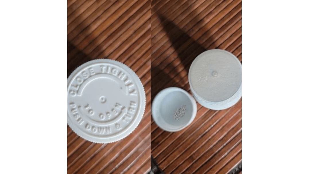
The picture on the left shows the cap of an herb container that I could never open on the first try. It looks very simple; they have written which direction is to open and which is to close, along with how to open the cap. So thoughtful. But was it easy to open? No! It opens only if it is pressed down in a certain way while you are turning it, and I would have never figured that out if I didn’t experiment with all probabilities.
No matter the designer’s intention, if a bottle cap doesn’t work the way it is supposed to, how will it be used by an end user?
Human-centered design (HCD) places the user at the forefront of the design process, acknowledging that usability issues often stem from poor design rather than user error. Through human-centered design, we strive to create products and experiences that prioritize user needs and enhance usability.
Let’s consider an example with water bottles:
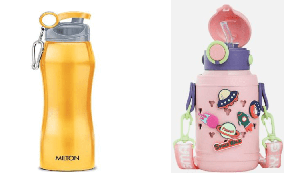
In the image on the left, you see a 1L stainless steel water bottle. What makes its design special? You can see the curves in the center that help me hold this heavy 1L bottle with ease and drink water comfortably, along with its leak-proof seals, and durable materials to withstand my daily use and transportation. The openable cap and wide mouth of the bottle help me clean it efficiently. Prioritizing portability, durability, and ease of use, this water bottle is a good example of human-centered design.
In the image on the right, you can see my four-year-old’s water bottle. The bottle is 500 mL and has a convenient straw made of food grade silicon that priorities safety. The lid made of BPA free plastic provides reliability, while the button to flip it up caters to a child’s independence. As in the previous bottle, the wide mouth helps in cleaning. Thanks to its flip-top lid that offers easy operation and spill prevention, and a cheerful design that attracts kids, this bottle serves as another good example of human-centered design.
Conclusion
The Norman principles that I've explored — affordances and signifiers, mapping and feedback, conceptual models, and human-centered design, are all interconnected facets of a holistic approach to user experience. By understanding and applying these concepts, you can create solutions that are not only functional but also intuitive, accessible, and delightful to use.
Now that you've got the ABCs of design, take them out for a spin in your daily adventures. See how your favorite gadgets and quirkiest contraptions measure up. It's like having a secret decoder ring for good design — suddenly, the world around you becomes a playground of discovery!